Responsive Design
Responsive web design & Why it’s right for business
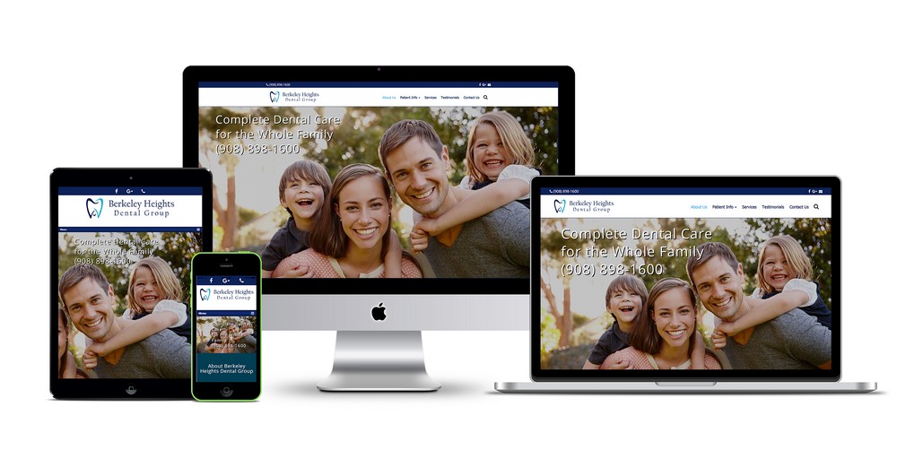
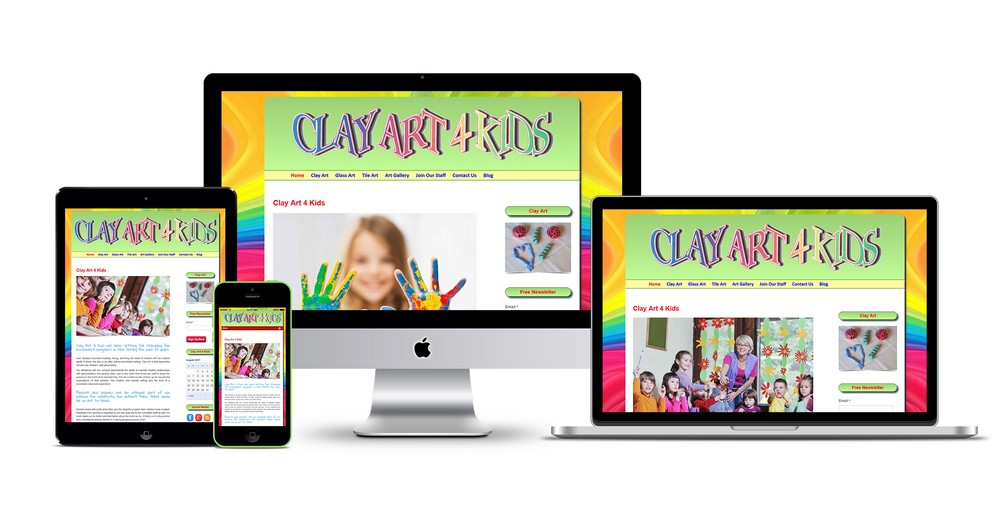
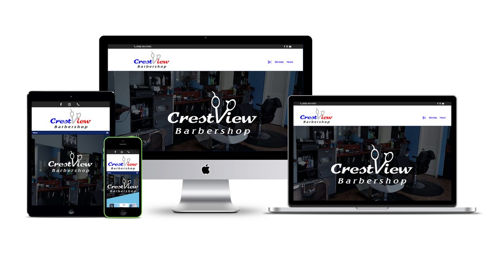
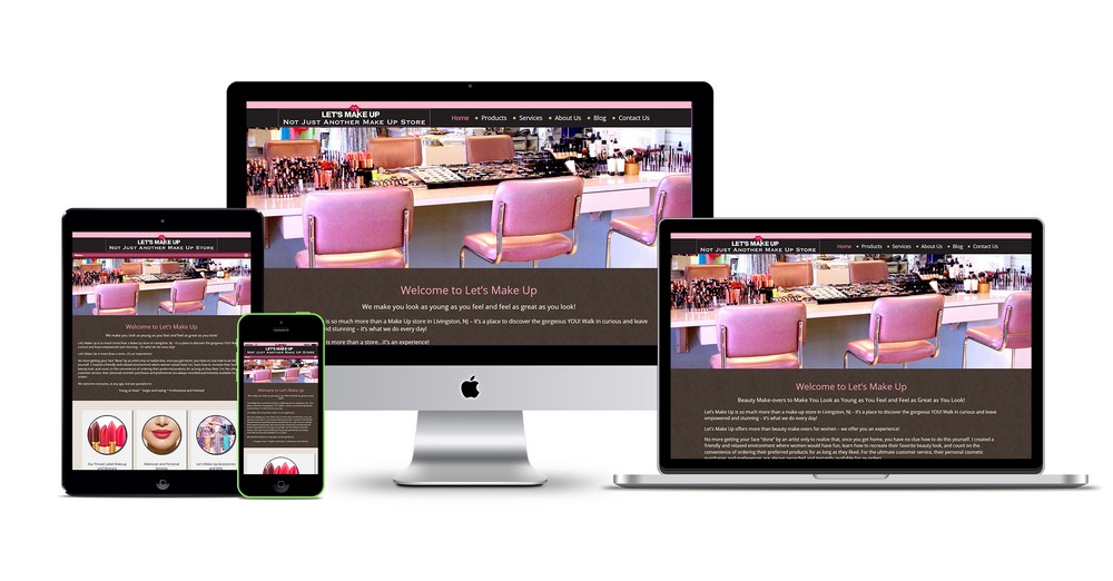
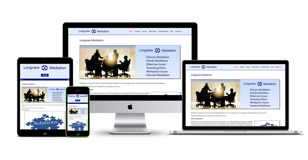
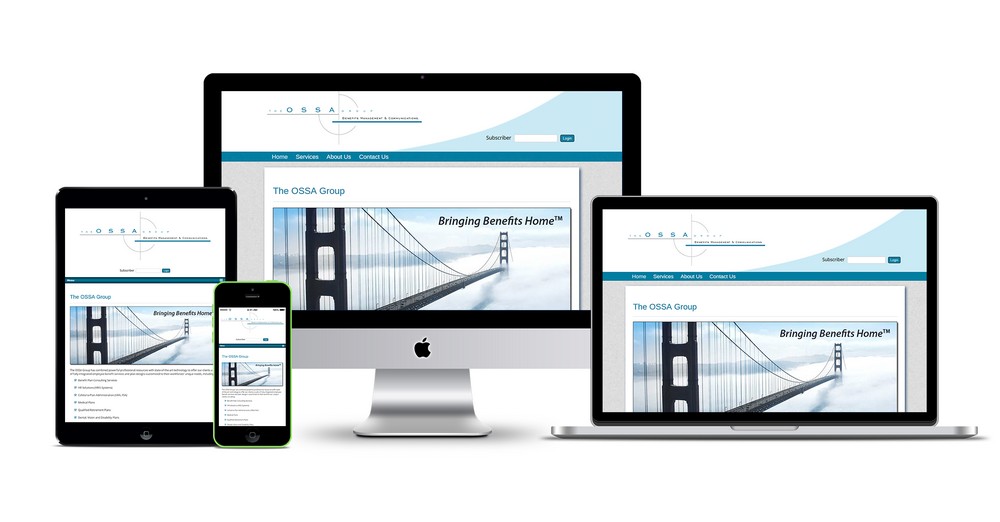
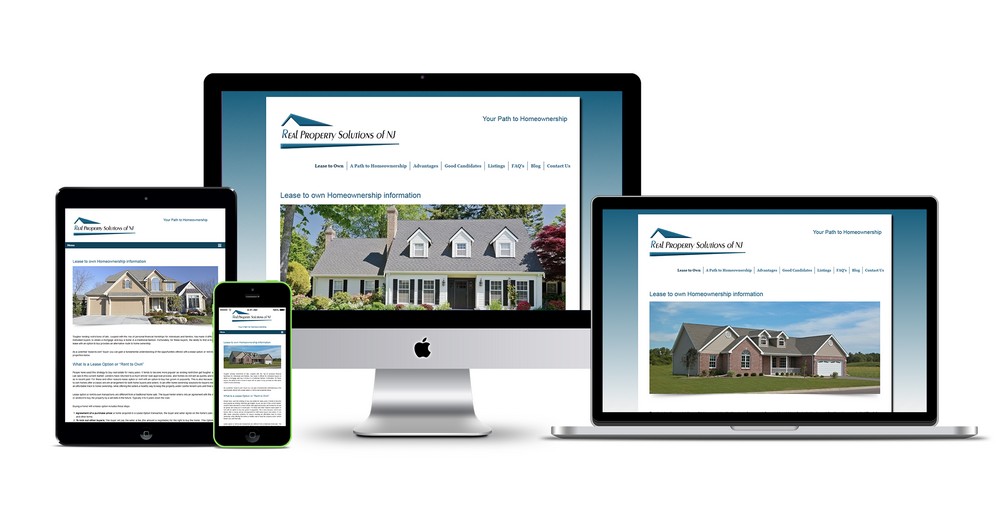
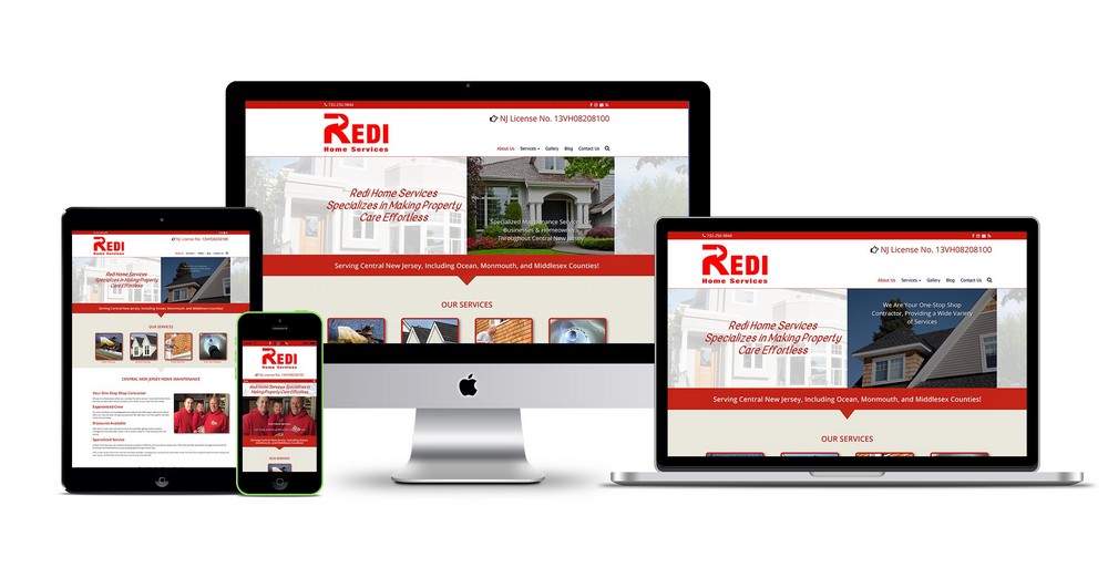
In simple terms, responsive websites are not device or platform specific. This does not mean that a mobile website is necessarily responsive. A responsive website rearranges content and images to fit different screen sizes and resolution. Having one site for mobile web users and another for PC users does not qualify as responsive design.
Responsive Design Features
It is important to note that responsive web design tutorial involves more than resizing images, so you have to take into account a whole raft of features such as:
Fluid Grids
This means creating a flexible layout that expands or contracts according to screen size. In the past, layout grids hinged on rigid percentage values. With fluid grids, site elements resize in relation to one another.
Screen Resolution
Manufacturers are churning out devices with varying screen resolutions that are able to render web pages in either landscape or portrait mode. Designing for different screen resolutions presents a challenge. However, responsive web design handles this issue quite well.
Responsive Text
Besides fluid grids and screen resolution, you can make text responsive as well. This does not mean that you have to resize or alter the typography of your web content. Instead, you deliver content that can easily fit into any given screen size.
Media Queries
Media queries form an important part of responsive web design tutorial. Even with fluid grids and responsive text, content and images may appear chunky on big screens or cramped on small screens. Media queries seamlessly integrate content to fit well on desktop as well as mobile browsers.
Designing a website for every available device does not make financial sense. The rule of thumb is to create a responsive website. The good news is you can make your website stand out even if you do not run a big business. Some of the desirable features involved in responsive web design include media queries, fluid grid, responsive text, and screen resolution.

