
 July 20th, 2026

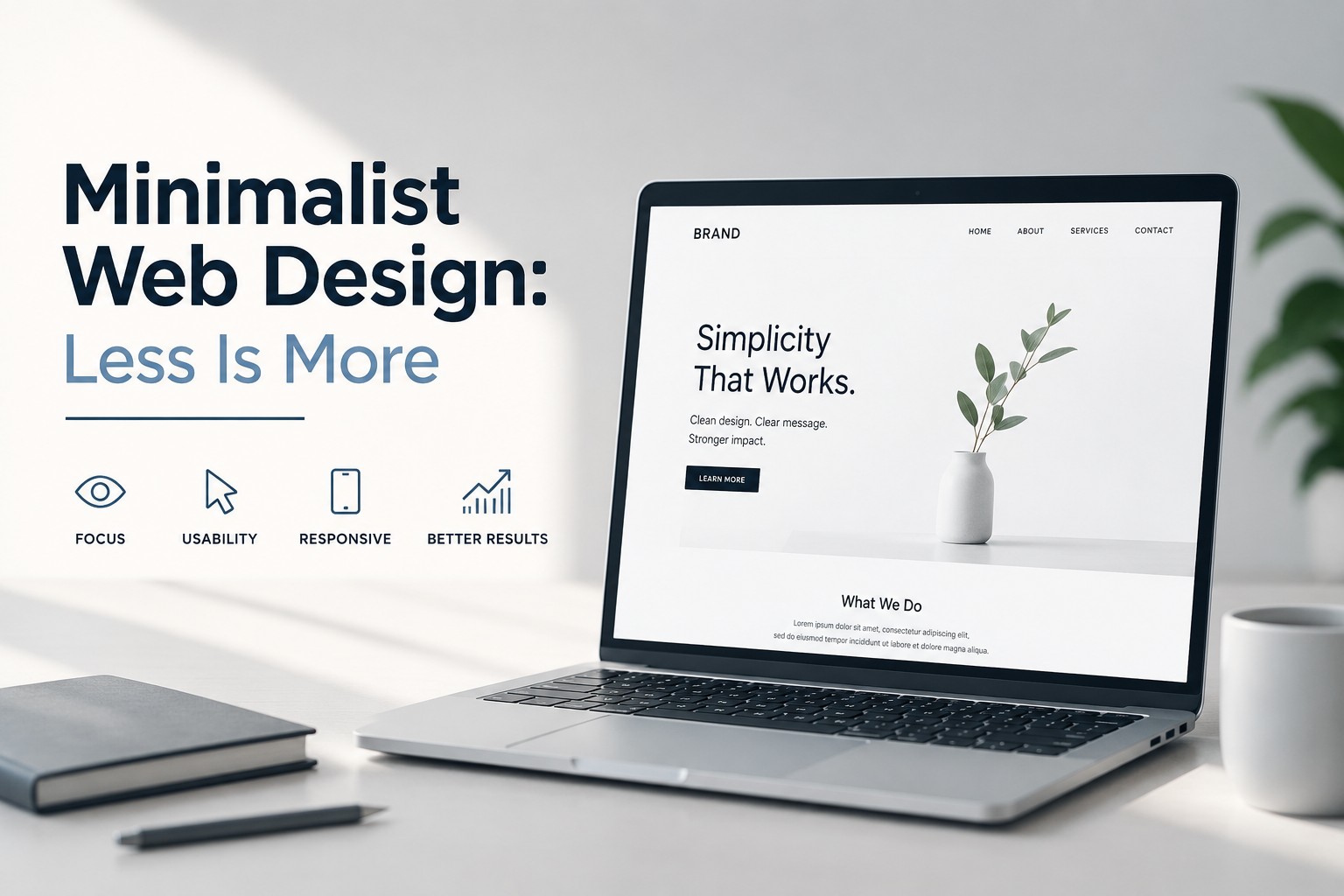
Minimalist web design is the art of saying “no” to everything that doesn’t earn its place. It’s not about making your site look empty it’s about making it feel clear. When you remove distractions, your content gets louder, your brand gets sharper, and your users get to their goals faster.
In a world where attention is expensive, minimalist design isn’t just a style. It’s a usability strategy.
What Minimalist Web Design Really Means
Minimalism on the web usually comes down to three principles:
- Clarity over clutter: Every element should help the user understand what to do next.
- Restraint over decoration: Visual design supports content, not competes with it.
- Intentional structure: Spacing, typography, and layout create meaning without relying on excess effects.
A minimalist site still has personality. It just expresses personality through typography choices, thoughtful spacing, and consistent layout decisions instead of heavy graphics or constant motion.
Why “Less” Works
There are practical reasons minimalist web design tends to perform well:
1) Faster decisions for users
When pages are visually busy, users must work harder to find what matters. Minimalism reduces cognitive load—so visitors can scan, understand, and act.
2) Better readability
Whitespace and deliberate typography improve how easily people consume content. If someone can read and navigate without friction, they’re more likely to stay.
3) Stronger brand perception
Minimal design often feels more modern and confident. When your layout is disciplined, your message looks more credible.
4) Often improved performance
Many minimalist sites use fewer heavy assets (large images, multiple scripts, animation-heavy components). That can lead to better load times and smoother experiences.
The Core Elements of a Minimalist Website
Minimalism isn’t just “clean design.” It’s an intentional system. Here are the components that usually define a minimalist site.
Typography that does the job
- Choose one primary font family (with limited variations).
- Use font size hierarchy clearly: headings, subheadings, body text.
- Keep line length comfortable (too wide becomes hard to track; too narrow feels choppy).
A minimalist site often looks professional because its typography is consistent and purposeful.
Color palettes with discipline
- Limit your palette commonly one neutral base plus one accent color.
- Use color to indicate meaning (links, buttons, highlights), not decoration.
If everything is colorful, nothing is.
Whitespace as a layout tool
Whitespace isn’t “empty space.” It’s structure.
- It groups related items.
- It separates sections.
- It creates breathing room so content feels less overwhelming.
Good whitespace is one of the fastest ways to make a design feel premium.
Simple navigation
Minimalist navigation typically prioritizes:
- clear labels
- predictable placement
- limited menu depth
Users should understand your site’s structure in seconds.
Layout systems that scale
Use a grid or consistent spacing scale so every section feels like it belongs. Minimalism breaks down when each page looks like a different designer got involved.
Minimalism in Practice: What to Remove
If you’re moving toward minimalist design, it helps to audit what you already have. Consider removing or reducing:
- Extra font styles (too many weights and families)
- Overdesigned hero sections (too many messages competing for attention)
- Nonessential animations (especially on first load)
- Low-contrast text (it may look “modern,” but it’s often harder to read)
- Too many buttons or competing CTAs
- Unnecessary visual elements (icons and graphics without a functional purpose)
A good rule: if an element doesn’t improve comprehension, navigation, or trust, it probably doesn’t belong.
The Art of the Hero Section: Make It Matter
The hero section is often where minimalist design shines when it’s done right.
Aim for:
- a concise headline that states value
- one short supporting line (not a paragraph)
- a single primary call-to-action
- supporting media that reinforces the message (optional)
Instead of stacking multiple claims, distill your offer into one clear idea. Minimalism thrives on focus.
Minimalist Doesn’t Mean Boring
Some people confuse minimalism with emptiness. The trick is using restraint while still creating emotional impact.
Ways to keep your minimalist site from feeling sterile:
- Use a distinctive typographic voice (bold but consistent).
- Add one strong visual element (a hero image, illustration, or pattern) instead of many small ones.
- Let your spacing and alignment do the “design work.”
- Use subtle accents like a single accent color or a restrained shadow to add depth.
Minimalism can still feel warm, human, and memorable.
Accessibility: Minimalism’s Hidden Superpower
Minimalist design often improves accessibility because it encourages:
- higher text readability
- clearer visual hierarchy
- fewer overlapping elements
If you’re serious about minimalist web design, accessibility isn’t optional it’s part of the “clarity” mission. Prioritize contrast, readable font sizes, and keyboard-friendly navigation.
A Simple Checklist for Minimalist Web Design
Before you publish, run through this quick checklist:
- Does each page have a clear primary goal?
- Is your typography hierarchy obvious at a glance?
- Are there fewer elements than before without losing meaning?
- Does the page breathe (good spacing between sections)?
- Is your color palette controlled and consistent?
- Are buttons and links visually obvious and distinct?
- Can someone navigate and understand the page quickly?
If the answer is mostly “yes,” you’re on the right track.
Final Thoughts: Less Is More for a Reason
Minimalist web design works because it respects attention. It reduces friction. It improves readability. And it makes your message feel intentional instead of accidental.
The best minimalist sites don’t remove things just to be trendy they remove distractions so users can experience what matters most: your content, your value, and your next step.